1. What skills have you developed through this module and how effectively do you think you have applied them?
The main skills that i have learnt and developed through this module is my presentation and illustration skills. At the beginning of the year i identified that i needed to improve my illustration skills, to get them to a standard which i thought was in line with the rest of my design here. I took the opportunity of using this module to find briefs which needed me to use illustration and thus i had to work on the skill and develop how i worked through illustration design. I now feel that after doing a fair amount of work on illustration aspects that i have developed this skill further, i still want to carry on doing this and get it even higher, but i think from looking at my work in this module, you can see that my illustration is much better than previous.
The second thing i have massively improved on is my presentation skills. Not only being able to present ideas and concept better, but putting together presentation boards. I thought i was okay at them before, but then when i actually sat down and looked at them, i thought they were pretty weak. In order to improve this i have produced presentation boards at the end of every brief i have completed, i feel that this has improved my presentation skills alot further and i feel more confident in doing them now. Also having to submit to competitions through presentation boards made me up my game in them in order to present the idea and concept of the competition submission.
Throughout the module i have also been working publishing and branding which again i feel that i have improved these to a more professional standard and would be something i would design out in industry, i would happily include them in my portfolio because i think they are strongly design led.
2. What approaches to methods of design production have you developed and how have they informed your design development process?
Within to of my briefs i have worked on publishing and editorial design. Within this i wanted to explore the use of paper craft, format and stock. I wanted to take a different approach to them and make them more interactive for the user, this makes them more interesting and something someone will take the time to read. I feel through these briefs i have identified a strong aspect of design that i enjoy doing and looking at through the idea of publishing. I think thinking about formats and how to interactive with the publication is a strong point of mine and shown that i can excel in this area.
I have also worked on bookbinding another area of design which i enjoy, coming up with new binding techniques for my products and adapting things to work with the bind. This has been further developed within the work
3. What strengths can you identify in your work and how have/will you capitalise on these?
I think within all this module i have taken a professional approach to it and tried to design work in which i would want to use within my portfolio. In doing this i think my work has defiantly become more professional looking and the concept and ideas behind them have been the driving force making them more than just something that looks good. This hasnt worked on every brief, but the majority i would say have.
I have taken alot more risks on this module, doing work which i normally wouldnt take on and entering competitions that i wouldnt normally do, but all of this has made me a better designer because i now have the confidence within myself to do it more and keep trying at new things. I have worked on a various different areas of design, which has shown me i can work across the board of design and produce well designed products.
The obvious strength for me when looking at the work as a whole is the publishing and illustration briefs, i think i have worked alot harder on these briefs and it shows in the products created. From the final crit i also got this feedback that these areas were my strongest. Combining this with format and bookbinding and i think these area all my strengths.
4. What weaknesses can you identify in your work and how will you address these in the future?
I think my main weakness within some of the brief have been not to push myself and be more creative / think about the concept more. I think this is shown in the greeting cards. At the time i was happy with the outcome, but looking back the final design of them isn't the best quality and i think if i had more time on it i could have pushed it further.
Also with the smaller briefs, just pushing them further to extend the product range and make them more into a project. I did do this towards the end of the module and created more of a product range from the main outline of the brief.
5. Identify five things that you will do differently next time and what do you expect to gain from doing these?
- Push myself further in some aspects of design. - branding, illustration
- Take more time over the concept and think it through thoroughly from the beginning - this will result in more informed and better designed outcome in the end.
- Be more organised on module submission day - result in a much more stress free day!
- Keep up to date with blogging - not to leave blogging until the end and to also blog as i find things that have informed me about the design decisions, instead of leaving it in folder and me forgetting to blog them.
- Always think 'what can i do extra' in a brief. - extending the brief and making a larger product range, shows how the concept can be expanded and also that Im not just thinking of what i need to do to answer the brief, Im looking at it from a wider aspect.
Attendance - 5
Punctuality - 5
Motivation - 5
Commitment - 5
Quantity of work produced - 4
Quality of work produced - 4
Contribution to the Group - 4
Thursday 18 April 2013
Tuesday 16 April 2013
OUGD505 // BBC Radio // Concepts
After coming up with the idea and where we were going to take this brief from doing the research booklet, we had to come up with 3 concepts that we could use in line with the idea of the brief.
Concept 1:
Audio and visual exhibition which uses interactivity throughout the gallery. This will work by using the spoken words of radio and exhibiting them through video and sound. The audience will learn about the radio through the clips and recordings of the radio. Visuals for the exhibition will come from images about the radio and of the radio throughout the years - using the history of the radio as the imagery for the visuals.


Concept 2:
Using the radio technology, parts and idea of radio waves as a visual aid to the exhibition. This will come through in the branding of the exhibition, for the exhibition itself I will use the idea of radio waves and how the radio connects to so many different areas and brings people together - the exhibits throughout the exhibition will be linked in some and use the radio waves as an aesthetic get this across.


Concept 3:
Interpreting the stations and shows of each BBC station and using the spoken words of the radio to create the artwork for the exhibition. This will focus on the tone of voice of each station and come through in the artwork for the exhibition. The whole exhibition could be based around one big piece which involves all stations or be a separate design for each station. Again it will work from showing the first radio shows to todays radio shows, and through typography and image, i will be able to show the difference in the shows.

Wednesday 10 April 2013
OUGD503 // Module Report and Evaluation
OUGD503 Responsive Module Evaluation.
Summative Evaluation
This module for me has been great, i have really enjoyed doing the live briefs and taking part in work which is set outside of the course. The briefs have felt like they are set to a standard which would be expected when working in the industry so this has been a good experience for when that happens.
The time scale on these has been a big influence for me, I have realised that alot of the briefs haven’t taken that long as i expected and i have been able to do alot more than i thought when i first set out. Its been a good way to break up working on other modules too, especially with the research part of the module we are doing at the minute, its been great to be able to have another module there which is purely design and the great thing thing about it is we could use a brief just to cover a couple of hours which is good to get away from another module.
I have liked being able to choose my own briefs and working around work which i think is good for my own practice, things which influence me and what i would like to do in the industry. I have always looked at selecting briefs which i think would look good in my portfolio and working to the standard which i would want to have in my portfolio, I have found that these type of briefs have been the YCN and D&AD briefs because they have more background to them and have more information which makes them a better brief and something that you can work on to expand into a wider range of products. Along with that a couple of the smaller briefs i have undertaken I would still think are on the same standard and would use within a portfolio - the Secret 7” and Hellfire i definatly would consider and I still think these are as strong as the others.
The range of briefs that I have covered has been another attribute to the module, I think i have worked over a large range of products throughout all the briefs, which again is something i wanted to do when i set out. I didnt just want to work on publications or branding, but i wanted to look at briefs which required me to so different design work to what i am used to doing. Take for instance the Feel Good and Milkup briefs, both of them are packaging briefs which require bottle label designs, usually this wouldnt be the sort of design direction that i would go down in a normal brief, but because these were the set outcomes it seemed a good challenge for me to take on and in doing that i have found myself enjoying these types of brief just as much as a publication or print brief.
Which takes me onto working out of my comfort zone. I have definatly found myself doing work which id different from my usual type of design, but this has been a great experience for me, i have ventured out of my comfort zone and when i did start doing them i was unsure what to do and where to start with them but once i got going, i loved it and now i wouldn’t think twice about taking on a a much wider variety of briefs in the future. It has also broadened my idea of products and what i know i can design and produce well.
The main thing with working out of comfort zone is that i have learnt so much new things and techniques. The major one for me is that i have improved so much on my illustrations skills, from doing the partner brief which left the illustrations down to me to do, I learnt alot from that, mainly having the confidence to do it and do it well, which has proven in the rest of my briefs because from then on, i think i have used illustration in every brief since. Another skill i have imporved upon is mocking up designs, the best one for this is the Feel Good Drinks, the tehcniques and tools i have learnt from doing the bottles in that brief have taught me alot for in the future and i learnt this by just trying it out and seeing what happened. I think that is something else i have taken from alot of these briefs, not to be afraid just to try it out, nothing can hurt by trying and if it doesnt work then rethink and do it again.
I believe that this module has taught me the value of presentation skills and photography skills. For every brief i have done part of the deliverables is being able to present the work to the client or for submission, which has meant to do presentation boards. In the past these have been the thing i hate the most, just because i never felt confident in the work i was putting on them was right and making them communicate the idea through images etc on a laid out peice of paper. But now after doing it for the last 10 briefs i have done, I think that i have got alot better, both with the images and content i am including in the boards and the general layout of them, i feel as though this has been a good skill to learn more about and something i have definatly taken with me throughout the module.
Along with this having the photography session part way through the module which showed us how to photograph our work to the best ability by using certain set ups and lighting to get it looking the best has made me realise that the photography of the work is crucial especially if you are presenting something through images and not having the actual object there. I have always taken images of my work in the past, but never thought that much about it and just taken it where ever, but after doing that workshop and seeing the results of using the photography studios, it is so much better and makes the work look better too. Its the finishing touches that count and get that given deal or extra marks.
All of this module has been about working on live briefs, i have done a mixture of big and small competition briefs and some live briefs from clients. Having the work there that could actually be used by a certain company, does put the pressure on, but i felt that i worked better under this pressure. I wanted my work to be better and produce a much higher standard of work because i wanted it to be chosen or be the winning entry, this definatly worked in my advantage. The best experience was having two of the competition briefs winning prizes.One of my Secret 7” designs was one of the judges choices and is now going to be displayed in an exhibition, which for me is a first and something which i find exciting. I loved the idea of the brief and that its all for charity, but having my work exhibited where there will be other professionals is a great start to getting into the industry and getting contacts.
The second was the Milkup brief which was a Designcrowd competition. This was for a client in China and right from start when i submitted my design i had a feeling i had a good chance because the client was in constant contact with me asking me to resubmit and making changes to the design. I did eventually win and won $200, which again was the first time i had been paid for design work. Not only getting paid was an advantage, but the way in which the client was always talking to me made it as though it was a client brief and not a competition which again having feedback and constant contact with a client is good experience, along with the fact my design will be used in China.
The creative partner brief for me was a good learning curve. In the past when we have done group briefs i havent really enjoyed it because in most of them the brief didnt go aswell as planned and ended up being a failure. This time it was different though because it was only one other person, which i was working with Greg. Overall i did really enjoy working wth Greg and we had no upsets or argument thoughout the whole brief. I think we played it right with the way we worked together and split the work down to work on the area we were both good at. This is the element which i liked the best, being able to split the work and get twice as much done in the same amount of time was great, but i did also think that the communication on this was abit of a let down. I didnt really get any input or knowledge about what Greg was doing, unless i asked him about it and had to keep asking him what he was including etc to find out about what he was doing whereas i feel as though i asked Gregs opionion on the work i was doing more and made sure he was happy with it as i was working on it and going along. A couple of times there was the incident of not turning up or on time which is soemthing you have to take into consideration when working as a pair because on certain parts we needed both of us there to do it. I would of liked to do a third element to the brief aswell but Greg was too keen on it and we did run out of time, so that wasnt really anything to do with us working, the time scale was just rather small.
Through doing this brief as a partner i did learn that compromise was important, you had to take into consideration how other people work - Greg preferred to work at home on his own whereas i preffered to work in the studio, i think this i why i felt a little left out on his side of the project because he would do it all at home on an evening or just not come into the studio when he was working on it. Working over two different media like we did in our and the digital not being my strongest area proved evident when i had ideas which neither of us knew how to do - compromising on the idea or what we wanted to produce definatly came into play on this side of things.
I did think this brief was a good experience and it proved to me that i can work in a group, i just prefer it to be a smaller group - this could work in my favour for looking for industrial experience, i now know i prefer smaller groups so looking for a small studio would work better for me as a designer than looking at big companies.
When looking back over this module at the work i have produced, just through this document i think it illustrates what this module has done for me as a designer. I feel as though i have learnt so much in this short time of doing it and that my work has moved on leaps and bounds from the experience of working on live briefs and doing things that i find interesting. I think i found the areas of design that i like the most from working through a wide variety of briefs, but there are also some area which i like but want and need to work on more to get them up to a better standard - Branding.
The briefs that i have enjoyed the most are Fedrigoni, Feel Good Drinks, Secret 7”, Its NIce That and Hellfire. I belive that these are the best briefs out of the ones i have completed and i think this because i have found them most interesting and connected with the brief better which in turn made me think of a better concept and idea. I like to know about the subject to get the best out of the design, but to do this i need to be interested in it or i wont get that much from it. When i know i like a brief and i know i want to work on it, it always has the best result. I now know that whenever i take on a brief or start a new brief, i need to find something within it which makes me interested in it, be it the subject itself or looking for an interesting format, concept or idea for me to work on and carry it through.
If I was to do this over again, I would spend as much time on it from the beginning as i have given towards the end, because in the last 3 weeks or so, i have loved working on these briefs and i think created the best design work from these so far this year. I just wish i had of done this from the start.
Taking away from this brief i have areas of design that I am realy interested in - publication, branding, packaging illustration and certain ways to takle these by looking at stock and formats. I still think that i need to work on some of these areas more than other in particular Branding, but that will come in the next module i am doing.
I am happy with this module and the work that i have produced i think it has had a big influence on me as a designer and shown me new things about myself.
Key aspects that are covered:
- Images of products
- Introduction to each brief outlining the concept
- Evaluation of each brief, covering influential stages of the project and the good and bad points
- Module evaluation. A full evaluation on the module as a whole, covering the key aspects of the module - what I did, why I did it and the good and bad points of it all.
Summative Evaluation
This module for me has been great, i have really enjoyed doing the live briefs and taking part in work which is set outside of the course. The briefs have felt like they are set to a standard which would be expected when working in the industry so this has been a good experience for when that happens.
The time scale on these has been a big influence for me, I have realised that alot of the briefs haven’t taken that long as i expected and i have been able to do alot more than i thought when i first set out. Its been a good way to break up working on other modules too, especially with the research part of the module we are doing at the minute, its been great to be able to have another module there which is purely design and the great thing thing about it is we could use a brief just to cover a couple of hours which is good to get away from another module.
I have liked being able to choose my own briefs and working around work which i think is good for my own practice, things which influence me and what i would like to do in the industry. I have always looked at selecting briefs which i think would look good in my portfolio and working to the standard which i would want to have in my portfolio, I have found that these type of briefs have been the YCN and D&AD briefs because they have more background to them and have more information which makes them a better brief and something that you can work on to expand into a wider range of products. Along with that a couple of the smaller briefs i have undertaken I would still think are on the same standard and would use within a portfolio - the Secret 7” and Hellfire i definatly would consider and I still think these are as strong as the others.
The range of briefs that I have covered has been another attribute to the module, I think i have worked over a large range of products throughout all the briefs, which again is something i wanted to do when i set out. I didnt just want to work on publications or branding, but i wanted to look at briefs which required me to so different design work to what i am used to doing. Take for instance the Feel Good and Milkup briefs, both of them are packaging briefs which require bottle label designs, usually this wouldnt be the sort of design direction that i would go down in a normal brief, but because these were the set outcomes it seemed a good challenge for me to take on and in doing that i have found myself enjoying these types of brief just as much as a publication or print brief.
Which takes me onto working out of my comfort zone. I have definatly found myself doing work which id different from my usual type of design, but this has been a great experience for me, i have ventured out of my comfort zone and when i did start doing them i was unsure what to do and where to start with them but once i got going, i loved it and now i wouldn’t think twice about taking on a a much wider variety of briefs in the future. It has also broadened my idea of products and what i know i can design and produce well.
The main thing with working out of comfort zone is that i have learnt so much new things and techniques. The major one for me is that i have improved so much on my illustrations skills, from doing the partner brief which left the illustrations down to me to do, I learnt alot from that, mainly having the confidence to do it and do it well, which has proven in the rest of my briefs because from then on, i think i have used illustration in every brief since. Another skill i have imporved upon is mocking up designs, the best one for this is the Feel Good Drinks, the tehcniques and tools i have learnt from doing the bottles in that brief have taught me alot for in the future and i learnt this by just trying it out and seeing what happened. I think that is something else i have taken from alot of these briefs, not to be afraid just to try it out, nothing can hurt by trying and if it doesnt work then rethink and do it again.
I believe that this module has taught me the value of presentation skills and photography skills. For every brief i have done part of the deliverables is being able to present the work to the client or for submission, which has meant to do presentation boards. In the past these have been the thing i hate the most, just because i never felt confident in the work i was putting on them was right and making them communicate the idea through images etc on a laid out peice of paper. But now after doing it for the last 10 briefs i have done, I think that i have got alot better, both with the images and content i am including in the boards and the general layout of them, i feel as though this has been a good skill to learn more about and something i have definatly taken with me throughout the module.
Along with this having the photography session part way through the module which showed us how to photograph our work to the best ability by using certain set ups and lighting to get it looking the best has made me realise that the photography of the work is crucial especially if you are presenting something through images and not having the actual object there. I have always taken images of my work in the past, but never thought that much about it and just taken it where ever, but after doing that workshop and seeing the results of using the photography studios, it is so much better and makes the work look better too. Its the finishing touches that count and get that given deal or extra marks.
All of this module has been about working on live briefs, i have done a mixture of big and small competition briefs and some live briefs from clients. Having the work there that could actually be used by a certain company, does put the pressure on, but i felt that i worked better under this pressure. I wanted my work to be better and produce a much higher standard of work because i wanted it to be chosen or be the winning entry, this definatly worked in my advantage. The best experience was having two of the competition briefs winning prizes.One of my Secret 7” designs was one of the judges choices and is now going to be displayed in an exhibition, which for me is a first and something which i find exciting. I loved the idea of the brief and that its all for charity, but having my work exhibited where there will be other professionals is a great start to getting into the industry and getting contacts.
The second was the Milkup brief which was a Designcrowd competition. This was for a client in China and right from start when i submitted my design i had a feeling i had a good chance because the client was in constant contact with me asking me to resubmit and making changes to the design. I did eventually win and won $200, which again was the first time i had been paid for design work. Not only getting paid was an advantage, but the way in which the client was always talking to me made it as though it was a client brief and not a competition which again having feedback and constant contact with a client is good experience, along with the fact my design will be used in China.
The creative partner brief for me was a good learning curve. In the past when we have done group briefs i havent really enjoyed it because in most of them the brief didnt go aswell as planned and ended up being a failure. This time it was different though because it was only one other person, which i was working with Greg. Overall i did really enjoy working wth Greg and we had no upsets or argument thoughout the whole brief. I think we played it right with the way we worked together and split the work down to work on the area we were both good at. This is the element which i liked the best, being able to split the work and get twice as much done in the same amount of time was great, but i did also think that the communication on this was abit of a let down. I didnt really get any input or knowledge about what Greg was doing, unless i asked him about it and had to keep asking him what he was including etc to find out about what he was doing whereas i feel as though i asked Gregs opionion on the work i was doing more and made sure he was happy with it as i was working on it and going along. A couple of times there was the incident of not turning up or on time which is soemthing you have to take into consideration when working as a pair because on certain parts we needed both of us there to do it. I would of liked to do a third element to the brief aswell but Greg was too keen on it and we did run out of time, so that wasnt really anything to do with us working, the time scale was just rather small.
Through doing this brief as a partner i did learn that compromise was important, you had to take into consideration how other people work - Greg preferred to work at home on his own whereas i preffered to work in the studio, i think this i why i felt a little left out on his side of the project because he would do it all at home on an evening or just not come into the studio when he was working on it. Working over two different media like we did in our and the digital not being my strongest area proved evident when i had ideas which neither of us knew how to do - compromising on the idea or what we wanted to produce definatly came into play on this side of things.
I did think this brief was a good experience and it proved to me that i can work in a group, i just prefer it to be a smaller group - this could work in my favour for looking for industrial experience, i now know i prefer smaller groups so looking for a small studio would work better for me as a designer than looking at big companies.
When looking back over this module at the work i have produced, just through this document i think it illustrates what this module has done for me as a designer. I feel as though i have learnt so much in this short time of doing it and that my work has moved on leaps and bounds from the experience of working on live briefs and doing things that i find interesting. I think i found the areas of design that i like the most from working through a wide variety of briefs, but there are also some area which i like but want and need to work on more to get them up to a better standard - Branding.
The briefs that i have enjoyed the most are Fedrigoni, Feel Good Drinks, Secret 7”, Its NIce That and Hellfire. I belive that these are the best briefs out of the ones i have completed and i think this because i have found them most interesting and connected with the brief better which in turn made me think of a better concept and idea. I like to know about the subject to get the best out of the design, but to do this i need to be interested in it or i wont get that much from it. When i know i like a brief and i know i want to work on it, it always has the best result. I now know that whenever i take on a brief or start a new brief, i need to find something within it which makes me interested in it, be it the subject itself or looking for an interesting format, concept or idea for me to work on and carry it through.
If I was to do this over again, I would spend as much time on it from the beginning as i have given towards the end, because in the last 3 weeks or so, i have loved working on these briefs and i think created the best design work from these so far this year. I just wish i had of done this from the start.
Taking away from this brief i have areas of design that I am realy interested in - publication, branding, packaging illustration and certain ways to takle these by looking at stock and formats. I still think that i need to work on some of these areas more than other in particular Branding, but that will come in the next module i am doing.
I am happy with this module and the work that i have produced i think it has had a big influence on me as a designer and shown me new things about myself.
Tuesday 2 April 2013
OUGD503 // Presentation Boards
Here are all the presentation boards of all the briefs that I have completed for the Responsive Module.
Fedrigoni
UK Greetings
Feel Good Drinks
Its Nice That
Hellfire
Secret 7"
Milkup
Spins & Snips
Fedrigoni
UK Greetings
Feel Good Drinks
Its Nice That
Hellfire
Secret 7"
Milkup
Spins & Snips
Creative Partners - Ellas Kitchen
Threadless - T-shirt design
Wedding Invitations
Ellas Kitchen - own contribution to brief
Threadless - T-shirt design
Wedding Invitations
OUGD503 // Responsive // Brief Outlines
As part of the module i have put together a document to show the brief, concept and deliverables of each brief i have worked on within the OUGD503 Responsive module.
OUGD503 // Responsive // Final Crit
In the final crit we were split in half and worked in pairs. For the crit we had to evidence all the briefs we had entered / worked on, this would be presented through using presentation boards.
With the crit format, we were looking at the work as a whole and looking at each individual briefs within the module, to evaluate if the work they had done was sufficient and showed a full body of work throughout the module.
We used a form to fill out to make it easier and this standardised the crit for everyone.
Crit Feedback:
number of briefs presented: 9
sufficient work: yes
sufficient evidence of planning: yes
is the evidence clearly presented: yes
is the evidence appropriate to the briefs: yes
is there sufficient evidence of reflection and evaluation: yes
Strengths:
All work is very well done, we think the strongest work is Fedrigoni and Ellas Kitchen. Excellent craftsmanship and binding throughout - which is expected from nathan.
Areas for improvements:
Could be extend logo brief to create a range
photograph the physical products e.g greeting cards.
Additional Comments:
Thorough and well executed work
Craft skills are excellent
Actions Required:
Photograph work
Extend smaller briefs into projects.
The feedback i was given i felt was fair, there was still things that i was working on at the time, so everything wasn't completely finished and all briefs were shown in this crit. The good feedback on my projects have given me good confidence in that style of work and something that i can look into doing more in the future. With the smaller projects I had planned to extend these briefs anyway, so this will come over easter when i have more time to do this.
OUGD503 // Threadless
Threadless Tee shirt Design Brief:
Submit a design to Threadless
You are Threadless. You make the ideas, you pick what we sell, you’re why we exist.
And the whole dang process starts right here. With your idea. Think you’ve got a show stopper up in that noggin of yours? Well pull it out of there and submit it!
Check out the steps below to submit a design for all kinds of products! (Bonus points for presenting your design on more than one type of product!)
With this brief it was a good opportunity to work on a t-shirt design which didnt have to be anything specific, it was up to me for the design of it and what it would be of.
I wanted to work on my illustration skills more and infact my drawing skills too, the one thing that i wanted to try and illustrate was an animal, so i set to work looking on the animal to illustrate, i decided on doing a antelope, because they looked interesting to draw and characterise.
After drawing the image out roughly on paper, i drew around the image with a fine liner to make it easier to see the outline when i scanned it in.

From this drawing I could then use the pen tool in illustrator to draw around the antelope image and make it into a vector

This was the initial outlined version of the antelope, which i was happy with, the drawing of the animal went much better than i thought, so when it came to digitally illustrating the animal it made it much easier because i could just follow the lines of the drawing, adjusting it here and there to make it flow better with the illustration.

This was the colour scheme in which i used throughout the illustration. Obviously the browns were for the colour of the animal, the three browns were for tonal differenced throughout the illustration. The burgundy red was for the ring around the animal, which makes it look as though it popping out of the design.

This is the final coloured image, i added a background colour just to emphasise the drawing and i thought it looked better on this background than white. When i was looking at the final drawing i wasnt that happy with the antlers of the animal, the top part of them seemed unbalanced, with the spacing between the top antler and the middle making the illustration feel out of proportion.

To correct this i simply took away the top section of the antler to leave this as the final design, as it will be mocked up on tee shirts for the submission of the competition i took away the coloured background.
SUBMISSION
For submission you could submit 3 slides of the design, this had to include the design and it mocked up on one of the products you intended it to work on.
I decided to submit three slides, the first being on a mens t-shirt. The second is showing it on a womens t-shirt and the third is a close up of the design. This shows versatility with the logo over different garments.

Mens top

Women's top

Close up

Evidence that the designs were submitted.
EXPANDING THE PRODUCTS
To show that the design could be used over a varied product range, i decided to mock the design up on more products, i wanted to keep it around the fashion product range, so i chose other garments, along with other accessories such as bags and cases.

Iphone case

Jumper

Backpack

Vest

Laptop Case
I think showing the design on these products show how versatile the design actually is and that it can be used over a varied product range. I am really happy with the design, as it shows here it can be adaptable and still work on all products, giving them a striking design.
This brief has been a quick turnaround brief and done in a night, i am happy with the illustration and drawing skills that i have worked on by doing this and created something over a wide range of fashion items, which isnt normally something i would do.
PRESENTATION BOARDS
OUGD503 // Its Nice That // Presentation Boards
After designing the app and the screenshots of each one, i have put together presentation boards to show the app and to explain the different aspects of it.
OUGD503 // It's Nice That // App icons and illustrations
Throughout the design of the app I have done a few different illustrations and icons top hat have been used within the app. Here I have collated them all together to show the illustrations of the project.


OUGD503 // Its Nice That // Designs
From working the initial designs out and planning out the categories of the App, i now know the number of different screens i need to design to show the app and how it works.
There will be a main layout to the whole app which will be consistent throughout the whole app. This will make it look consistent throughout.
I have designed the screens within a rectangle which fits onto the image of an iPhone, this was to make it easier for when I mock the app up on the presentation boards, but it also gave me a restriction for the size of the layout, I could work out the proportions of the full design from this.

This is the home screen, which will be displayed when the app is first launched.

This screen is particularly for the podcast menu, but this is the main background of every screen within the app. I chose the yellow colour because it is a bright and vibrant colour and the contrast between the yellow and black works well. I think something with a strong colour will attract people to it and make them look at the app. The logo in the top corner is present on every screen, this gives the app an identity continuously throughout. Where the title 'podcast' is present on this example it will change for each category title, but stay in this position all the time. This again gives a constant style to the app and something that you can identify when you look through it.

This is the main menu of the app. The home of the app, here you can access all areas of the app and see what it has to offer. A the app is for creative students I have made it simple, but using the icons makes it more creative and aesthetically pleasing. The icons represent the category. With this screen I have kept it simple and old by using the black on yellow, which is a tint of the main yellow colour used on the navigation. I think that this as a main screen and the first thing the user would see, sets standard to the app and you can defiantly tell what the design of it and the way it should be used from seeing this screen.

The first category is the search area by using different categories of design. On this menu you have two different options - you can search yourself by using the search bar or you can select a category by scrolling through the thumbnails below, these are shown as a hash tag and when clicked on will bring everything related to the category up on screen. The lower section of the app works by scrolling with your finger, you can scroll down and to the right - this is done like you would normally scroll on an iPhone. Scrolling the lower section reveals more categories.
From clicking on a category thumbnail or searching a category yourself, you be brought to the selected category screen, you can identify this by the category being displayed in the top right corner. The way each screen works for displaying the blog posts, is in a cascading window. All the posts have a thumbnail which are displayed in a arranged order within the screen perimeter, this creates a wall of creative images on a selected subject. Again this scrolls down and across by using your finger. To read about the post you simply click on the image. To navigate back to the search screen you swipe backwards - from left to right - and this will take you back.
The blog post screen. Once you have clicked on a post thumbnail, it takes you through to the post, which has all the post story and images etc which are within the post. This is scrolled up and down so you can read and see the full post.

Monthly archive menu. Here the user can search through the its nice that posts by months. The screen is set out in a calendar which is to play on the creative aspect and to make it more interesting to use. This screen scrolls up and down and you navigate to a monthly section by clicking on the individual box.
As you can see this is the same screen as the previous category screen, all the screens work in the same way and are seen the same. This is to make the app more accessible and easy to navigate around. The month is displayed in the top right corner and you can scroll down and to the right to reveal more post thumbnails. Clicking on an image takes you to the full post. This screen brings up everything that was relevant in the chosen month, so it will have things from every category of design.
The same post screen is used for the blog post. This agin is shown in the top right corner and it displays all the information and images of the original post.

Regular features is a section of the website which the contributors take control of. These are sections which are down to them and written by them. The initial screen of this section is similar to the category one, each feature has a thumbnail image and is displayed on the screen - this doesn't scroll as the features shown are the only ones. Again when you click on a feature image it takes you to that feature page.
Feature menu. Here all the feature screens are designed in the same way, because they have a set structure to each feature and everything within that feature is the same it is just dates throughout the layout of these sections are rigid and set to gridded structure. This makes it easier to view each post and to navigate through. The difference with these screens is that they have a small description at the top left, this describes the feature so the user knows what it is about. As the same as before you click on an image to access the full post.
This is the screen of the feature blog post. It's same as all the rest has is navigated around the same.

Events menu. This menu displays all the events that Its Nice That are involved in. It is displayed in the cascading window again, which can be scrolled down and across to reveal all the events. The section title is in the top right. To access the events information and to find out more about it, you click on the image to take you through to the information screen.

Podcast menu. The podcast is something that is recently new to Its Nice That and normally you would download them through iTunes to add to your iPod, iPhone or iPad, but a this app will be available for all three devices it made sense to include it within the app and cut out having to download them etc. Here you can access all the podcasts from Its Nice That and listen to them within the app. Clicking on the date of the podcast takes you through the the podcast player.
Podcast player. Here you can listen to the podcast. You will be given information on the podcast - which tells you what is involved in it. At the bottom of the screen is the podcast player. A simple play pause and stop button lets you navigate the podcast with the time line along the bottom, this lets you see the length of the podcast and where you are through it. You ca simply skip through the podcast by scrolling the timer along the time bar.

The last section of the app is the contact section. This section has two purposes firstly Its Nice That is available on various social networking sites, the icons are shown within this section and you will be linked to them through the specific app or Safari when you click on the icon. He second function gives details on how to contact It's Nice That, with information on how you can submit work and work with them.
This brings us to the end of the app design. I am happy with the design of the app, i think the consistency of the design throughout each section makes the app have a much more professional aesthetic and makes it easier to view and navigate through. These are all the key aspects which I wanted to address and design right as I think they are key for the success of a app. The creativity runs through the app and if I was to use it I would find it really interesting to use and to find new inspiration. I wanted it to mimic the website but in a more smart phone and user friendly environment, which I think I have achieved.
OUGD503 // Its Nice That // Mocking up Screenshots
From designing the different screenshots of each section which I did to fit the image of the iPhone I am using here to mock up the app to show how it would look when used on the iPhone. This will work the same and look the same on all the apple smart devices, but the size of the screen will obviously differ.

The welcome screen. This screen is viewed when the app is launched and gives a quick glance of what the app is and who it's by. On this screen the vibrant colour of the yellow works well and contrast against the black shiny colour of the iPhone. Both the colours and material of the iPhone offset each other and make this an attractive and eye catching first opening screen. 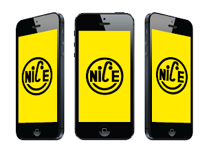

Angled views of the app opening screen.

Home screen of the application.
Again now the screen is mocked up on the iPhone the simple and bold icons of each section work well within the setting of the phone and against the accent colour of the app interface.

Monthly archive menu.
Again the black of the calendar and the boldness of the design fits in with the aesthetic of the iPhone.

Selected category screens. The arrows at the side shows in which direction the app can be scrolled, this comes into use more within the presentation boards, but I thought it would be useful to use here too.
The design of these screens fits in well with the proportion of the screen on the iPhone and looks good in the environment it is placed within.

Category menu. All the elements of this design work well within the design of the screen and now mocked up on the iPhone makes it look proper and the idea and navigation of the app seems to look more realistic and as though it will be effective within the app.

Monthly archive screens. These are designed to the same as the category screens, to make the app consistent throughout. Again they fit in well with the iPhone and the space of the screen works to the advantage of the app. I think the navigation system and the way you can scroll works to the advantage of the app.

Regular features.
This has just the sections shown on this screen screen but can be scrolled both ways to reveal the full thumbnail. The spacing and layout of the screen works well and looks good within the iPhone.

Features selected screens.
The post screen is the same as all the others, but the difference in this section is the feature screen in which you choose which post to read. A previously explained why in the post before, the gridded structure works just a swell as the cascading window and sits nicely within the iPhone screen, the proportion of it works well and as the images are all the same size the informed looked works with the proportion of the iPhone shape.

Events menu.
Working in the same way as the previous sections of the app. This fits in with the iPhone and should perform well with the navigation system.

Events post screen.
The information of the events is displayed here which is shown in a informed two column grid. This splits the iPhone screen down into a useable area for text which can be scrollable and work as though its is a magazine or book. I think the post screens all work well and should be easily readable.

Podcast menu.
This has elements of both designs of the different screens, it has the full bleed image at the top but the informed grid underneath of the podcast dates, again because these are all the same and the only change is the date which is pretty important, the user needs to be able to read them easily, having them displayed like this does just that.

Podcast player.
I particularly like this screen because it has the main accent colour at the top and bottom, with the tint in between. This gives a really vibrant look and feel to the screen and makes the screen stand out really well. The simple buttons for the podcast player should be easy to use on the touch screen and also fit in well with the boldness of the iPhone.

Contact section.
This screen more than any other has more white space around it which I think works well. The colour of the app comes through more which fits in with the black of the iPhone and contrasts well. The tint of the main yellow used also demises through more on this screen and again works both with the iPhone and the main yellow accent colour.
Before when I was designing the screens of the app, I was happy with the direction that I took for them and the colour scheme that I used - I really liked the black on yellow, but now I have mocked the designs up onto the iPhone I think it makes them look much better. The designs now have context and the way they are designed and purpose of them seems to come through more now they are placed within the iPhone, which is great. The colour of yellow works really well with the colour of iPhone, which I am pleased about and makes the app have a strong vibrant aesthetic to it, along with the simple and bold icons, the design stands out to me and hopefully makes it more attractive to the creative students.
Subscribe to:
Posts (Atom)