
From designing the different screenshots of each section which I did to fit the image of the iPhone I am using here to mock up the app to show how it would look when used on the iPhone. This will work the same and look the same on all the apple smart devices, but the size of the screen will obviously differ.

The welcome screen. This screen is viewed when the app is launched and gives a quick glance of what the app is and who it's by. On this screen the vibrant colour of the yellow works well and contrast against the black shiny colour of the iPhone. Both the colours and material of the iPhone offset each other and make this an attractive and eye catching first opening screen. 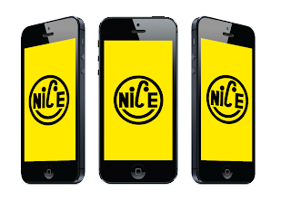

Angled views of the app opening screen.

Home screen of the application.
Again now the screen is mocked up on the iPhone the simple and bold icons of each section work well within the setting of the phone and against the accent colour of the app interface.

Monthly archive menu.
Again the black of the calendar and the boldness of the design fits in with the aesthetic of the iPhone.

Selected category screens. The arrows at the side shows in which direction the app can be scrolled, this comes into use more within the presentation boards, but I thought it would be useful to use here too.
The design of these screens fits in well with the proportion of the screen on the iPhone and looks good in the environment it is placed within.

Category menu. All the elements of this design work well within the design of the screen and now mocked up on the iPhone makes it look proper and the idea and navigation of the app seems to look more realistic and as though it will be effective within the app.

Monthly archive screens. These are designed to the same as the category screens, to make the app consistent throughout. Again they fit in well with the iPhone and the space of the screen works to the advantage of the app. I think the navigation system and the way you can scroll works to the advantage of the app.

Regular features.
This has just the sections shown on this screen screen but can be scrolled both ways to reveal the full thumbnail. The spacing and layout of the screen works well and looks good within the iPhone.

Features selected screens.
The post screen is the same as all the others, but the difference in this section is the feature screen in which you choose which post to read. A previously explained why in the post before, the gridded structure works just a swell as the cascading window and sits nicely within the iPhone screen, the proportion of it works well and as the images are all the same size the informed looked works with the proportion of the iPhone shape.

Events menu.
Working in the same way as the previous sections of the app. This fits in with the iPhone and should perform well with the navigation system.

Events post screen.
The information of the events is displayed here which is shown in a informed two column grid. This splits the iPhone screen down into a useable area for text which can be scrollable and work as though its is a magazine or book. I think the post screens all work well and should be easily readable.

Podcast menu.
This has elements of both designs of the different screens, it has the full bleed image at the top but the informed grid underneath of the podcast dates, again because these are all the same and the only change is the date which is pretty important, the user needs to be able to read them easily, having them displayed like this does just that.

Podcast player.
I particularly like this screen because it has the main accent colour at the top and bottom, with the tint in between. This gives a really vibrant look and feel to the screen and makes the screen stand out really well. The simple buttons for the podcast player should be easy to use on the touch screen and also fit in well with the boldness of the iPhone.

Contact section.
This screen more than any other has more white space around it which I think works well. The colour of the app comes through more which fits in with the black of the iPhone and contrasts well. The tint of the main yellow used also demises through more on this screen and again works both with the iPhone and the main yellow accent colour.
Before when I was designing the screens of the app, I was happy with the direction that I took for them and the colour scheme that I used - I really liked the black on yellow, but now I have mocked the designs up onto the iPhone I think it makes them look much better. The designs now have context and the way they are designed and purpose of them seems to come through more now they are placed within the iPhone, which is great. The colour of yellow works really well with the colour of iPhone, which I am pleased about and makes the app have a strong vibrant aesthetic to it, along with the simple and bold icons, the design stands out to me and hopefully makes it more attractive to the creative students.
No comments:
Post a Comment