Friday 30 March 2012

Life Lessons//Futher development of publication

I have started to put the publication together and start to lay out all the pages, throughout this i have split the publication into 3 sections, the middle section is designs which are created from the woodblock type i produced at the beginning of starting this, the other sections either side of it are digital work, i thought the woodblock section in the middle would split up the publication and give it some variation throughout, otherwise i thought it may be abit boring.


For each of the sections i have laid out the text page next to it differently, just so each one has a different aesthetic, again this is to mix the publication up and make it more interesting. All the text layouts have been designed with the same thought of clean strutted design.

The information on each page will describe the quote in more detail and be of motivational language. This will only be a short description, but is needed to give the publication extra depth to it.

A few examples of some of the descriptions:
Draw Now Think Later - 
Draw now think later is all about getting your ideas down straight away, whatever comes to your mind draw it. The process of this is to get everything down on paper, all the good ideas and the bad ones. Once you have got them all there you can start to look at the good ones and looking at these should produce more ideas along these lines.

This is a way of developing your ideas and thoughts, by getting rid of the bad ideas, it cleans your mind and focusses on the good and positive ones. Making you produce better ideas.

This quote is about not thinking about anything and just letting your hand do the work, once you have the ideas there you can then start to think about it and how to improve it.

Follow your dreams -
Everybody in life has a dream job or a place they want to be, but why does nobody ever forfill them?

If you want something you should do everything you can to get there and not let anything or anyone get in your way of doing it. People around you should recognise what you want and should support you in doing so. Never let anything get in the way of what you want to do with your life, its your life, live it how you want.

Two heads are better than one - 
When you come to a place in life, be it a big decision or a time when you feel low, a second mind or person to talk to is always the best way. Don’t let things build up within yourself, this will just make the matter worse.

All you have to do is pick up the phone to a family member or friend and let it out, you will feel much better about it.

Tuesday 27 March 2012

OUGD404//Type Hierachy

Today i looked back over the type hierarchy task we had and did a few more of these to refresh the whole thing in my mind. Its good to break down a piece of work to the different point sizes or weights of type, to see how many have actually been used and the variety of the type present in each design. I do quite enjoy doing and studying this, it can be interesting especially when you compare a good piece of work to a bad one.

Fuzzy logic promotional flyer - heir achy of point size and colour/one which stands out most


Hifi promotional flyer - heirachy on point size


Wire promotional flyer - hierachy on point size.


LCA exhibition booklet - hierachy on point size.


5 rules of type as an image - own design work - hierarchy on point size.


Life Lessons//Publication

So now that i have the majority of my designs done for the publication, i have started to collate them all together in an indesign document ready for the publication.
The publication is going to be the designs on one side and then some text about each one on the next page, I'm sure how this will work at them minute because i don't think there will be that much information for each design, but it could look good with the white space around it.

To start with i drew out some page layouts to test different ways in which i could layout the publication


From these layouts i have chosen the ones that i want to use within my publication.


Further progress of publication - layout with text.
To start with i tried out a few different layout options which could work for the text page. As there isn't going to be a lot of text i wanted to isolate it to the corner closest to the design, this will connect the information to the design and show more white space which i am wanting.

 With these different layouts i have tried it with both helvetica and bebas.


Out of the layouts i prefer the one that along the bottom near the solid line or the one which at the top but over two lines. My favourite it the the one with the title at the bottom, but i think i might use both because this will give the publication a variation throughout and not look exactly the same on each page. I prefer the title being in Bebas, the contrast between the two typefaces work better, as betas is a heavier weight font it stands out more from the body copy so you see the title first. 

Full publication layout
As i was going through the publication applying these layouts to each page, it looked bland to me and was very repetitive, so i thought i would split the publication into 3 sections, each section will follow the same layout, but there will be three layouts throughout the publication. This should make it more interesting to read, i don't want to do too much with the layout as its more about the design on each page than the layout, thats just there to make the publication professional, which it should do as it has a structured and clean look to it.

Life Lessons// more designs

So i have been carrying on the designing for my publication of the life lessons, the last few designs i have been doing are using woodblock letter type. To get this i went down to the print room and printed the letters i needed to make up the posters, i then scanned these in to use on the posters. I was going to actually print them myself, but as we are coming up the easter break and the print resource is closed the majority of it this wouldn't be possible. I am going to print them myself at some point when i have more time.


Postage stamps//Revised work

From the crit on friday i was given some feedback on the stamps that could be improved, these were:
- try changing the colour of the stamps to either different opacities or different colours
- on the front cover the spacing from the sides need to be increased and back of booklet needs looking at.

Stamps
Original

Same colour at different opacities

All different colours, but still in keeping with the road sign colours. Each stamp is a different colour of road sign.

Out of the two new design colours i have created, i think i like the red but at different opacities the most, this is because it is still in keeping with the idea of red and linking in with the road sign, which red road signs are giving you an order/warning so this to me makes more sense it being like this, with it being at different opacities it makes the stamps more interesting and they all stand out differently now instead of merging together.
I do the different colours one, but as a set of stamps together all the different colours make my eyes not know where to look when i see them, which isn't what i want to happen. 

Booklet


For the booklet i basically just need to move the type around to give it more space from the edges. So i have moved everything in a little bit more. On the back page i had to resize the text at the bottom to make it more legible.

Printed versions of the revised stamps:


Second colours of the revised stamps


Out of the revised stamps that i have done, i didn't like any of them to start with but now i have printed them i think that the stamps in the different colours of red work the best. This is because when you look at them you can see a distinct difference in each stamp and it makes you look at them all individually, before it was just a blur of red stamps and you couldn't tell them apart.

With the coloured ones i think it is too much, the colours work together well, but it is too much when you fist see them and it doesn't appeal to the eye.
The best one is defiantly the red stamps in different shades of red, these are my final design of the stamps.


Monday 26 March 2012

Interim Evaluation

- Evaluate the problems that you identified and had to resolve within the brief:
From the start of the course i found that having more than one brief ongoing at a time, was difficult for me as in college i was used to working solely on one brief at one time. As we got more and more into the course i have being able to control this and get used to the fact of this.
Another thing i wasn't used to doing was the design sheet and idea generation, i haven't really taken that much time over them before or if i did it was something i did at the end of the brief, but from being here and working with other around me i found that doing this does make a big difference to your designs, the thought process and experimenting with different ideas can lead to a much better thought out final design, which has been proven. I now take a lot longer over this process of the design cycle and i have found that my work has improved which the majority of this is down to this process.
I still feel that my drawing skills let me down, i have basic ability of drawing but nothing special, i do really want to improve this, as i know it will make me a much better designer, that is something that i want to look at over the summer.

- Evaluate the key considerations that you had to take into account when investigating:
When investigating the brief, the main thing i like to find out first id the purpose of what the final resolutions will be used for, this gives me the whole idea for them to be based upon e.g used for advertising an event, to inform about a subject matter. This also gives me the means of what i need to research in to, to find the right information for the content and for the background information to understand the whole concept of the brief more.


- Evaluate the research activities that you had to undertake in order to resolve the brief:
Throughout the briefs we have done so far this year i have found that research is so important. Before doing the whole OUGD405 module which was a research based module, i didn't realise how important research was, i used to just do it at the end of a brief to make get extra marks! But now i understand it a lot more, spending more time and doing more detailed research makes you understand the whole idea of what the subject matter is, this makes you produce work that is relevant to this, also the content used within my designs make more sense and is in correspondence to the idea of the brief.

- Evaluate the examples of secondary research that informed your design decisions:
Throughout the various briefs we have done, i have used secondary research mainly to look for design work that it similar/in a style i want to work with for inspiration for the brief. I have always done this throughout the time i have been doing graphic design and find it the best way to start the generation of ideas. I find looking at design work that i can use the idea of different elements etc to take into my own work really useful, the only problem with this is that it can sometimes look like copy, but i have never had this experience. In this case the best evidence of this was probably the D&AD brief and the 100 things brief, for both these i looked into work which was of a style i wanted to design around and used certain elements of these within my own work.


As you can see design research that i had found and liked the style of determined the outcome of what my final design looked like.


The other use for secondary research is to get the relevant content for my design work. If i am designing something that needs to have information about a certain subject then i would research into this and find information i could use within my design work.


The content within both of these designs is taken from secondary research online from various sources.


- Evaluate the examples of practical research that informed your resolution:
For some of the briefs we have had to gather information that acts as feedback or content for the work in which we are creating, or in some cases it can determine what the outcome of my work would be. The best example of this would be in the module '100things', i did a survey for this module to gather information that would back up my idea, i wanted to find out information about travelling and if people have had experiences of this. The information from this survey gave me the idea for my finished solutions but also provided some content for part of it too, so surveys are a good way in finding primary research.


Other forms of practical research i have undertaken throughout the year include photography, looking at relevant books to do with the given subject and looking at books on my iphone etc. For primary research in any brief i try to vary the type of information i look at, be that video, books, online, interactive, I think from varying the type of media you look at can generate more ideas and make you think of different ways in which you can design. 


 - Evaluate the breadth of initial ideas that you generated in response to the brief:
As i have in the first question, when i first started this course my idea generation and initial ideas was pretty poor, as before i never really took much notice in these, i used to just get an idea and run with that straight away, i also saw them as a chore to do and found them boring. Since being here i have seen that use of design sheets are very important and experimenting with ideas at the being is essential as this can generate more ideas in the first place or experimenting with two different ideas can make a better final outcome. Now i wouldn't imagine not doing design sheets, i see them as the essential part to the brief and i now rattle off more and more each brief!


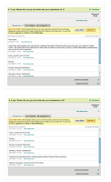
This was some of my design sheets that i did just for the first crit, before i had decided on the actual idea and before experimenting with these ideas.  

- Evaluate the breadth of visual investigation that you have explored before deciding on your design direction:
Visual investigation is something that i like to do right at the start of a brief, even before i have come up with any sort of idea. This in itself i see as a process of idea generation. I have done this all the time throughout studying graphic design, its just something i picked up and kept on doing all the time. When i first get a brief, i always go and look at visuals on design blogs, designers websites that could be linked in some way to the brief or even just for inspiration on the style of work i think could be interesting for it. From this i start my idea generation and then once i get the idea i go back and find more visuals that are connected to the subject i want to produce my final resolutions on.
Even when we don't have a brief or something that I'm not designing i like to just look through design sites and blog and look at work that is out there being produced, its something i do in my spare time to keep my mind ticking over on stuff like this, its the majority of the stuff that i find that give me the ideas for most of design work i do.