
The branding which i chose to use was the 'Slik' branding. Now when i was doing the workshop i found this the easiest to create designs with, but i still wasnt happy with the designs, so i looked into the company more and found out some more information about them.

This is 'Slik' website, which are in fact a zip and garment manufacturing company. So this straight away gave me alot more ideas on what i could include on the packaging other than the circular logo; because that was looking dull. I also got the colours i needed to work with by using the websites colours too.
After looking at this i went back to the design sheets and started to create some more designs which were alot more focused on the company and you could identify the company from looking at it.


As you can see the design work is now a lot more contextual towards the company and some sort of meaning behind it all. I decided to go with the design shown above, as i felt that this design could be adapted the best throughout the different packaging and sizing. I still wasnt sure about the additional text and where the placement of that would be, but i thought i can play around with that when actually designing it digitally.
To start off with i got the colours i was working with into a swatch, so i had them there ready to use.

Then i designed the two separate elements to make up the design for the packaging.

This logo was taken from the original business card i had, when looking at the font that was used on it, to me it looekd like it was Arial and that was the best fit from what i could find digitally, so i ran with that, then altering the tracking on each letter made the type alot more like that of the business card.

Next i worked on the zip and found an image online, which i could work from to design it to the closest fit, which here i think i have done a good job, it definitely represent a zip and you can see what it is illustrating when you look at it, which was the important factor.


I played around with the placement of the zip with the logo and eventually decided to go with the top left as i thought this was the most balanced design out of them all.
From choosing this design i then edited the design more and made it fit in with the colour scheme, changing the colours and edited the zip to make it look more realistic to end up with the final logo of:

Now my logo is done for the packaging, i need to draw out the packaging nets ready to drop the designs onto.
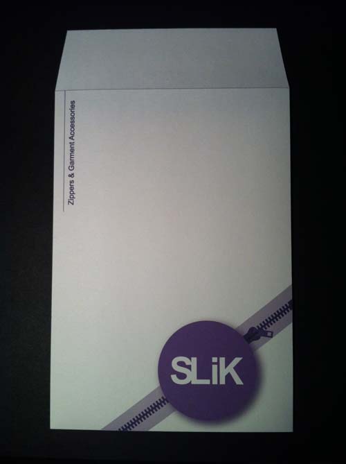
I have chosen to use a box, bag, receipt holder, envelope and thin box.


After measuring and drawing out the nets of the packaging digitally i started to apply the logo and other information to each net. On each one i wanted to keep the logo the same and in the same orientation, to make them look like a full branding set, but i did want to change the layout of each net and the placement of each of the elements, this would vary the products and make them more interesting to look at as a set of products.


I am pretty happy with the results of the packaging designs, i think that the logo itself works well for the branding of the company and gets across what the actual company is, it is slightly different to that of their own logo, but all i have done is added the zip to make give it more context and recognisable of what the company is when you look at the logo.
For the packaging designs, i feel that each one is different and works in there own way, the variant packages have lent themselves to how the layout of the information and logo is placed and i think that each one is done right and works well for that particular packaging net.
Before i printed the packaging nets out properly i did a rough copy of each net on normal paper, this was to see is the placement and the actual design on the packaging worked and was in proportion to the size, i was glad that i did this because i did find that some of it did need re-wokring and slight adjustments needed making for it to be the best it could.
For the actual print, i decided to print it onto antique white paper, i chose this stock because the colour would work well with the purples of the logo and type on the packaging, also this stock has a texture to it a sort of recycled feel, but the texture reminded me of a fabric like look, which fit in well with the whole company branding.


No comments:
Post a Comment