Thursday, 29 November 2012

Design for web // Scamps, Site Map & Wireframe

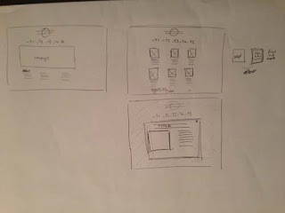
These are the scamps, site map and wireframe of the original website which i proposed to do, as i have gone along with the brief, my ideas have changed and the website has changed so this will be different to the actual website that i will create.

Site map of the website

Wireframe of the website.


Digital scamps of the website

Initial sketches of scamps and wireframe for the original website.


Scamps of both homepage and linked page


Wireframe of both homepage and linked page.


Final Website - Scamps, Site Map and Wireframe
After changing the design of my website i have created a new design for the scamp, site map and wireframe which are as follows:

Wireframe - this is the same as the original website as the number of pages etc have stayed the same its just the design which has changed.


Initial drawing of the scamp

After looking at the scamp more and when it came to doing a digital mock of it i didnt like the intended website design.


So i decided to change the website design again and came up with the following, which i have now decided is the right one and the one i am going to stick with, because i like the aesthetics of it and i think it will work better than the ones above as a website for the given content.

Digital Scamp of the website.


Homepage.


Linked page.

Digital Mock ups of the website. This is what i intend the website to look like when it is a finished product.


Wireframe of the website. From this i will use the measurements to design the actual website on dreamweaver.


Wednesday, 28 November 2012

Design for web // Devlopement of website

After changing the design of my website i have started to create it again, which wasnt too bad as i could just adapt the previous website design.


Homepage

VW T1 Transporter

Showing the rollover on the navigation

The website is designed with all the content in place, the other linked pages still need the photos putting in place. I am currently working on the coding for when you click on an image it will open a bigger window with more information on it. Once this code is done the rest of the pages will be easy to create.
On the background i may add an illustration or illustrations down the right side, to fill the space as it looks abit out balanced, but i want to get all the content in first.

Design for web // Final Crit

For the Design for web crit we were split down into small groups which we went around in pairs to crit each others work.
I was a little dubious about this crit, as i had been working on my website and had something there to show, but i wasn't feeling 100% positive about it myself, so i wasn't sure how it was going to go down within the crit.

Feedback 1
Strengths
- simple, clean design which allows imagery to be focused
- enthusiasts will be able to understand the buttons
- direction boards are text heavy but useful
- colour palette is appropriate

Areas for Improvements
- background is abit flat, perhaps a static VW logo could tie everything together
- pastel colours mixed with a bold colour is not as effective as 2 pastel colours. Have you thought about making the buttons the pastel colour?

Considerations
- consider extending the imagery to full page like in your research
- consider an intro or about page to give the pages context.

Feedback 2
Strengths
- really good start to a working website
- good links with research and final designs
- primary images are very professional
- colour scheme works well with vintage style and imagery

Areas for Improvements
- content could be developed further...'history of vw' maybe?

Considerations
- what does T1, T2, T3 etc mean? Will the audience know?
- Arrows
- Consider how you display the facts.

As a whole i don't think this was particularly bad feedback, but it wasn't the best positive feedback which i wasn't expecting. There are areas mentioned on this feedback which i knew myself that i needed to add in and change, but it was still a working in progress website.
The main points i took away from this were about the actual design of the website and the content and how it may not be suitable, so this got me thinking about changing the design of the website and making it better to understand and easy to access the information which the user would want as this is an information website about VW campervans.


OUGD503 // Fedrigoni // Concept & Final Idea

After coming up with several ideas previous to this i have developed some of the ideas and now i have a solid concept and idea which i am wanting to carry out for this brief and work on within the OUGD503 module.

Concept
I will create a campaign which will inform printers across the UK about the range of Fedrigoni papers available. This will consist of a information pack, which is solely based on paper craft and user interactivity and website & app which will let the printer access all papers available, to view and find out the specifications of them.

Outcomes
I will produce an information pack that will consist of 5/6 publications of the most useful papers for printers. These publications will use paper craft and pop up elements to bring the papers alive and show the use and adaptability of them.

The website and app will be a online resource for any printer / designer to access all the fedrigoni papers available and see the range, use and specification of each one.

The design will be consistent across the two platforms.

Expanding upon this:
Create an information pack which will be posted to printers. This information pack will include 5 publications which display and inform about different ranges of papers Fedrigoni offer and which are useful to the printers.
The publications will be created using paper craft to make them interactive, pop ups, layers of stock and interacting pages. This will demonstrate the adaptability of the papers and how they can be used in an interesting way within a project.
The content of the publication will show what each paper range is best for and demonstrate this within the publication. Specifications and wieghts etc will be used to describe and explain the full range of the papers.
This information pack will inform all printers and designers about the Fedrigoni paper ranges available and make them the favoured paper merchant.

Along with the information pack i will also design a website and app which work with the information pack. This will be a resource where any printer/designer can access all the information about a paper range and see the different colours/finishes/textures available and order them straight from the web or app itself. The design of this will run from the publications and make it consistent project and design that runs across both platforms.


Concept Boards
For the concept pitch tomorrow i have put together some concept boards which show and describe the idea of my project and how i am going to tackle the brief. This includes images of research and the direction of work i am undertaking. I have tried to keep them image based mainly as i think this gives people a better understanding of where you are heading, than just describing it in words.


OUGD503 // Fedrigoni // Initial Ideas

From the first session we had with Fred about pulling the brief apart, i went away and started to think of  outcomes and ways that i could approach this brief. In the session i had some quick ideas of what i areas of design i could focus on. I want to try something new, but incorporate it to something that i also know a fair bit about so that the outcome will be interesting but be a good standard of work too.

In the session i had some ideas of working with paper craft, installations, 3D work and interactive publications, video, web.
I have developed these ideas and come up with a range of ideas that explore these initial ideas that came to me.

Areas of Design:
- video
- publication
- poster
- web
- mailshot
- installation
- interactive

1. Video showing stocks in multiple ways - animated - showing process of making them - packaging, letterheads etc
- All comes together to make one product - Show Fedrigoni - Make the Logo etc
- animated, time lapse

2. Print Campaign
Large scale adverts and small scale flyers etc. Showing capabilities of the stock.
- set out like branding with different products laid out. Shows how papers can be branded into something else.
- Packaging, print based media - all to do with business.

3. Publication / Info Pack
Interactive/3D publication that shows different paper and what they are good for.
e.g. packaging, embossing, cutting, folding.
Make these interactive within the publication
- info pack // multiple page document // coptic stitch // japanese bind
- Publications explains and informs about the papers and weight etc of them
- use letter cut. screen print, etc to make more interesting.

4. Installation
3D installation, use different papers to make different products which all come together and create one thing.
- HP Print advert - Kinston Universtity


HP - invent from Films & Things on Vimeo.
----------------------------------------------------------------------------------------------------------------------------------

This is... campaign to run through products or on its own?
This is Fedrigoni
This is Packaging
This is Sirio Colour

- can work throughout some of the products and outcomes or work on its own as a campaign.


Design for web // Revised Scamp

After the final crit we had on tuesday, i received some feedback about the design of my website and the use of the slideshow within the pages. It seemed as though people didnt think it was suitable for the intention of the website, which when i looked back at it again i do agree, so i have redesigned the website slightly and changed some things around to make it better and more suitable for the content within in.

Initial drawings of Scamps for the redesign of the website:


For the redesign of the website i have added more information about the website and reduced the big image on the homepage, the navigation is now at the top of the page too. This gives a more balanced website. The linked page works in a grid of images, which when clicked open a larger image and description of that model. This works better as the user can choose what they want to look at and find information about.


After changing the homepage to this design, i didnt like the look of it and decided that it was the centered design which i didnt like, as it had alot of white space either side which made the website look really small and that there wasnt a right lot on it.

So i redesigned it again. This time making a left aligned website, this would be better as there would only be space to the right of the website. This time i have kept the background colour white, so there is no difference with the colours of the background. I have made the main image slightly bigger but still having enough room for more content about the weskit below. The whole website is set out within a three column grid, which is taken through to the linked pages. These pages act exactly the same as described above.


This time the website has a much more balanced design, i like the white space down the sides and top and the whole look it fills and uses the screen space a lot better than previous designs.

Monday, 26 November 2012

Design for Web // Crit Presentation Boards

Background and Research presentation board, which explains the concept of the website i why i have chose to create it, along with some research which i used to create the initial scamps

Site map of the website and the content that will be on each page

Wireframe of the website, showing the specifications of the sizes, colour, fonts etc that will be needed to create the website.

Digital mock ups of the homepage and a linked page from that. This shows what the website will look like when it is created and coded.

What the website will look like on screen. This illustrates how it fits within the screen size and hows the ease of use.


Design for Web // Creating the website

After finalising the Wireframe, Sitemap and Mock up Designs i started to create the website and I aimed to have a working homepage with all the links linking out to the pages and being able to get back to the homepage for the crit tomorrow.
I did manage to do this today!
I decided to use the file we had been working on with simon in the web sessions. I thought this would be the best idea because i knew that, that was working fine and all the correct coding was in it, I had to adapt the design and layout of it to match what i wanted but i felt confident in doing that.

Once i had started to change the original website file, i did infact find myself basically coding the website from scratch again, just inside the original file, as the website we had originally created in the sessions was nothing like how i wanted mine. This was good though because i started to learn more and actually realise what i needed to do to create the website and how to fix and solve things that went wrong along the way.

Like i said above i have managed to get the homepage designed and coding, which links out to the other pages and they all link within and back to the homepage.


Friday, 23 November 2012

Design for Web // Mock Site Designs

From my final scamp and wireframe, i have designed a mock up of the website, this is the homepage and one of the linked pages. This shows what the content and layout of the website will actually look when properly designed.

Initial design of the wireframe of the site, here you can where the logo, content and links will be placed within the layout.

Initial design for the linked pages, again this shows the logo, content and links. See how i have used the main content area from the homepage to hold the content for the linked pages, this makes everything consistent and flow across the website.


Actual Design of Homepage
This is the design of the homepage for the website, with the correct content and logo etc. For now i am going to use the links at the bottom as they are, but i dont particularly like them because i think they are abit bland and boring, but id rather get it coded and working then i can think about changing them after.


Actual design of linked page
Here you can again see the design of one of the lined pages. the logo stays in the same place and the main image changes to become the content area. This will hold content on each model within the range which will change by using the arrows at the side. As you can see i have also tried a variant link button at the bottom, which is the shape of each model series. But i think this is too much for the links and it takes away your eye from the main content in the middle of the page. Its makes it too complicated and over crowded - your eye doesnt know where to look.


After changing the link buttons back to being the solid colour, i think think this works alot better, it may be simple and not be very creative, but it works well for the navigation purpose and does fit in aesthetically with the design of the website. 


Once you have clicked on the link button and are taken to that page, a rollover on the button will reverse the colour out when you are on the page, this is to show which page you are actually on and to make it easier to navigate.


After looking at the design in more detail, i felt that the arrows which will flick through the different vehicle models within each generation look too close and cramped within the content area, so i have moved them outside this and place them vertically centered in the two coloumns each side of the content area, this gives more room within the content area and looks more balanced on a whole. 


Logo Design

Initial ideas of logos for the website, but i found these too boring and lack of design to them.


These started to interest me more, but i didnt like the use of the yellow, well im unsure about it yet, i did another version with a lighter blue, which i think works well, but its hard to see against the white background, so im not sure which to use at the minute, but i like the design of them and think they will fit and look good on the website page.


Wednesday, 21 November 2012

OUGD504 // Design for Print // Amendments

From the final crit which we had for the Design for print brief, i have come up with a list of amendments that i need to correct/ do for the final deadline.

Amendments
After the crit I spoke with Lorraine who went through my publications and looked at them in detail and marked any areas which could be improved /  errors within the design of it.
- single words on the end of a paragraph
- lines within the page design needed to be aligned - some are out by a pixel or so
- spelling mistakes - COLOUR
- line spacing

Things left to do
- create net for packaging and sample pack
- send publications to print
- finish the outer of the publications


Overall the design of the publications and all the content is complete and to a high quality which my feedback has shown. There are some errors and bits that need tidying up within the publications but apart from that they are ready to print. I need to source the net for the packaging and sample pack and get them designed and printed to complete the whole brief.

OUGD504 // Design for Print // Final Crit

For the final crit today i had the majority of my products of the manual there and ready. After doing the mock ups of the packaging and sample pack i felt more confident about it and ready for the feedback on my work.
For the publications i printed them black and white, so that there was something to look at, but i wasnt too bothered on the colour as this could be seen on issuu.

Feedback 1
Strengths:
- good grid layout, consistent
- clear illustrations
- laser cutting has worked really well
- really well executed, layouts are neat and structured

Areas for improvements:
- Thumb space
- page 9, book 2 - missing characters

Considerations:
Body copy and headers are similar in design - perhaps try two different typefaces.

Feedback 2
Strengths:
- Covered all areas whilst keeping the same high quality - no part looks rushed
- clear, precise, visually pleasing
- Love the layout, consistent throughout both books.
- even when lots of information its spread out in a way that splits it ip and makes it readable
- change in point size works - looks professional
- use of duotone makes it consistent within the publications - used when necessary which is great.

Area for improvements:
- only thing were not sure about is orange and blue but thats personal choice - its for you after all.

Considerations:
- stock used for front covers possibly a little too bold/bright in comparison to ones used inside publication
- love the cow
- book 2 - pages 14-15, looks abit cramped, maybe rearrange
- really interesting binding method.

Overall common feedback from the group:
- Good research
- Contents pages needed / more detailed.
- Pages numbering
- Basic type skills
- Proof reading
- Line spacing

Presentation boards - too much writing, not read it when its that long.
In future have max of 4 lines of text.

OUGD504 // Design for Print // Mock ups

For the very first crit which was all about the concept of the brief i created a quick mock up of the publication and it was going to combine the two publications together into one.


Having this mock up was a great idea and worked well within the crit, as it gave a visual idea of what it would look like and how it would form the publication.

As that worked so well in the first crit, for the final crit i again printed out mock ups of the two publications. These were only printed in black and white, because the colour versions were on my blog, but i wanted to print these out so you had an actual to scale sized version of the publications. Again it was evident that it helped throughout the crit process. It was also beneficial to me as i was able to ask Lorraine about the design of it and she could look through them and mark and write where things needed to be changed.

Publication 1

Front cover


Contents page, with corrections


Double page spread, with corrections


Publication 2


Front cover


Contents, with corrections


Double page spread with corrections 


Double page spread, with corrections


All the images above are of the two mock up publications, as you can see throughout the crit process they have been marked and show adjustments which need to be taken out in order to get this to best possible finish and ready for print.