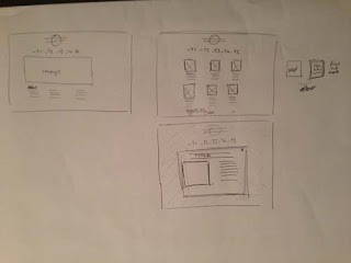
Initial drawings of Scamps for the redesign of the website:
For the redesign of the website i have added more information about the website and reduced the big image on the homepage, the navigation is now at the top of the page too. This gives a more balanced website. The linked page works in a grid of images, which when clicked open a larger image and description of that model. This works better as the user can choose what they want to look at and find information about.
After changing the homepage to this design, i didnt like the look of it and decided that it was the centered design which i didnt like, as it had alot of white space either side which made the website look really small and that there wasnt a right lot on it.
So i redesigned it again. This time making a left aligned website, this would be better as there would only be space to the right of the website. This time i have kept the background colour white, so there is no difference with the colours of the background. I have made the main image slightly bigger but still having enough room for more content about the weskit below. The whole website is set out within a three column grid, which is taken through to the linked pages. These pages act exactly the same as described above.
This time the website has a much more balanced design, i like the white space down the sides and top and the whole look it fills and uses the screen space a lot better than previous designs.


No comments:
Post a Comment