
After some thinking and jotting down ideas i came up with my concept which was to use the eagle as a symbol. After some research and looking into the meaning of the eagle, it made it more clear that this would fit into my concept and idea behind the label:
The natives honor eagles for their opportunistic ways. They depicted this as work smarter not harder, this as a message and symbol would fit in well for a creative network, targeting young creatives.
An eagle also represents masculinary, dominance, power and ruler which all have a relevance to the beer itself - its a masculine beer as it is as bitter, dominance shows through in the strength of the beer and power and ruler are reperented by it being the best on the market.
Not only does this link in with the beer itself but the eagle also stands for opportunity, freedom, community, skill, inspiration, determination and vision. All these meaning link in with a creative person and the creative network.
I have therefore used a double headed eagle to bring these two ideas and elements together to represent both the beer itself and creatives and the Creative Network.
Creating the label
To start with i had to draw out the double headed eagle - i found some imagery online to help me draw this out and plan out the illustration.

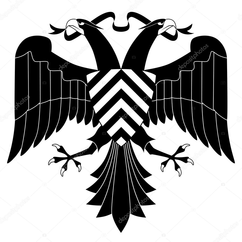
I liked the idea of having the shield in the middle of the two eagles so i adopted this idea into my own illustration and this hold the name of the beer. I also wanted to have a banner along the bottom of the illustration where i could put the name of the beer and 'creative networks', i wanted this to be a curvy and floaty banner, like a mediaval style to it.

I began by drawing out the head and the shield, once i had drawn one eagle head and neck i could duplicate it to create the second, i did the same on the shied too.

Next i did the eagle legs and the banner along the bottom. I added a bottom decretive section to hold extra information on the beer.

The wings came last, which i just drew out one and then duplicated to create the second.

This is the final imagery for the double headed eagle logo.
From this i could now start to create the actual label and add the appropriate text and colour to it.

For the text i wanted a typeface which would fit in with the style of the logo and look good too. I felt that this fit the criteria, it was the right style that i wanted - sort of medieval but more modern as well. It is bold and stands out in a small point size too.

after adding the text the logo now looks like this. I particularly like the 'HF' in the shield, i think this adds to the logo and makes it stand out a lot more. The wording along the banner at the bottom has worked out pretty well too. Im not too sure about the bottom extra bit which has 'a fiery 5.2% pale ale' that section doesnt seem to sit well with the rest of the logo

Alternate layout of the text in the bottom section.

Now i had the main logo i had to fit it into a label shape. I wanted the label to be a simple shield shape, but as you can see the logo is quite rounded and this didnt fit to the shape that well.

So i made it more straight, by having the straight edges which the curved bottom, the logo would sit nicely into the bottom section of the label. And because i had to scale down the logo to fit into the label size the smaller text isnt that legible anymore so i am going to add this at the top of the label - this means i no longer need the bottom section of the logo as you can see here it doesnt fit right.

finished front label. With added text along the top.
I now need to add colour, which I am going to use a light cream as the label background with a dark red / burgundy for the logo colour. I have chosen these colours as i think the burgundy colour symbolises the concept and stands out within the label itself.

Finished front label with all correct colours. I am happy with this as a label and i think it works really well, everything fits together well and i think it has a good concept behind it.

For the back label, i used the same heading as on the front, but beneath added the description of the beer. Beneath this i have used place holder text as its all the contents and legal information you have to put on the label but i dont know what this is. At the bottom you have the alcohol content and size of the bottom along with a barcode. You can see faintly in the background i have kept the logo, this keeps the labels consistent with each other along with the use of the same colours.
From this i created the bottle caps. I have done three different designs, which all are taken from the design of the label. You have the hellfire text with brief description. The 'hf' initials and the main logo itself. Any of these could be used but personally i like the 'hf' or the main logo - but i think the 'hf' would be best to use as the logo is very detailed and at the size of the bottle cap i dont think you would see it well enough.

From that i then created a beer mat. This again incorporates the main logo and the title of the beer with the descriptions. These could be used as two separate designs or as i intended to be front and back of the beer mat.

The beer labels in context. I have placed the beer labels on a beer bottle to show the various angles and how it looks in place. I think with the colour of the beer bottle the label really fits in well the colours are reflected within this. The size and shape of the label fits the bottle well and i could see it working in realt life.

Presentation Boards
No comments:
Post a Comment